Image

When it comes to buying fruit and vegetables, it's all about the visual – or better yet, autopilot. Store brands dominate the shelves, and the difference between brands is barely noticeable. Yet, in just four years, BelOrta became a brand people recognize. So, how do you become number one in a category where brands are almost non-existent? Keep reading to find out.
In a market where decisions often come down to 'what's on offer,' we aimed to position BelOrta as a distinctive multiproduct brand that evokes awareness and emotion. Not just 'a sticker on your tomato,' but a brand that represents craftsmanship, origin, flavor, and pride. A shortcut to trust.
We also realized: it's not about shouting louder, but about building smarter. That’s why we introduced the brand narrative 'Heerlijk van hier': a heartfelt invitation to embrace local flavor. We shaped this message in a distinctive style, highlighted by a single, bold visual element.
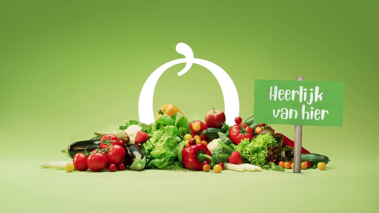
The 'O' from the BelOrta logo became the visual and creative anchor point. We turned a graphic detail into a distinctive brand asset. In this way, we stand out in a category where branding is generally weak. The 'O' symbolizes BelOrta as the guardian of freshness, flavor, and craftsmanship.
The 'O' became a recognizable feature across all touchpoints, from TV spots and social media visuals to in-store materials. On packaging, it even became a quality label, a visual promise: this is local. This is BelOrta.


We seamlessly linked product campaigns together into a larger, recognizable brand story. This way, we maintained consistency in style and message, while constantly sparking interest with fresh creative angles.
Year after year, campaign after campaign, the impact grew. Each new action built on the previous one. This not only created recognition but also trust.


The 'O' was always at the center. As a style element. As a brand stamp. As a memory trigger.
In this way, we not only influenced brand perception but also physical availability and shelf recognition.


In just four years, BelOrta grew into the top-of-mind fruit and vegetable brand in Belgium, even surpassing Chiquita. The once anonymous 'O' is now spontaneously associated with BelOrta by 56% of Belgians. Brand consideration increased by more than 30%.
What started as an ambitious brand story was gradually built into a recognizable whole. With consistent creativity, we proved that repetition doesn’t have to mean boredom—it can mean reinforcement.


